


PRIDE MONTH 2025! Our Inside Look feature at Broken Frontier provides creators with the opportunity to share exclusive commentaries on their comics projects with our readers, giving insights into the genesis, process and themes of their work. It’s one of the oldest regular features at BF, first appearing on the site back in the mid-2000s and also one of our most well-received. Today, as part of our Pride Month 2025 celebrations Eve and Spire Greenwood talk about their graphic novel Ruin of the House of the Divine Visage.
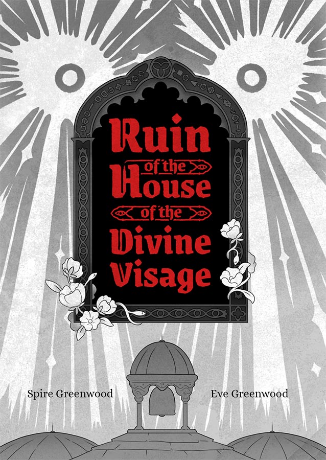
Ruin of the House of the Divine Visage is a 130-page graphic novel, co-created by spouses Eve and Spire Greenwood. We started working on the concept for the story back in 2020 before we even started dating and crowdfunded a print run of the completed graphic novel in August 2024, just before Spire moved to the UK and we got married.
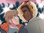
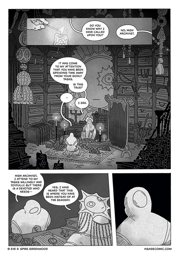
The story follows two devotees of the House of the Divine Visage, a monastery whose god is housed inside its very chambers and where showing one’s face is forbidden. The two main characters, Seneca and Mordecai, accidentally see each other’s faces and fall in love while wrestling with fear and shame. We already had the bones of the story before we went into scripting – we often collaborate on stories and world-building together, and Ruin was originally just one more of the many plots we liked to pick over – but as we started to work on the comic more seriously it became a way for Spire to talk about and process his religious upbringing as a queer person.
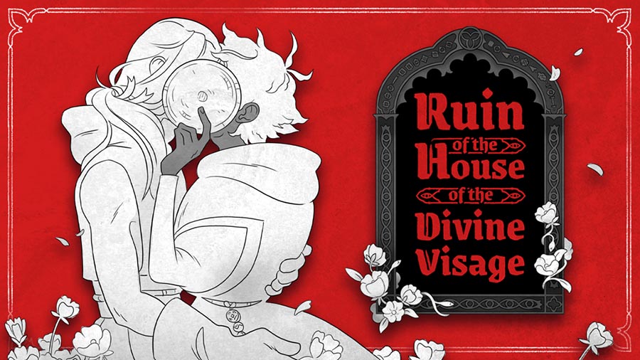
Ruin presents a closed little religious ecosystem that revolves around the tending and worship of a deity with a physical presence. Mordecai is introduced fear-first, essentially. He represents the god-fearing believer who is cowed into obeying the wants and needs of his congregation. Seneca, on the other hand, holds an awed, resplendent view of the Divine Visage, which is reflected in his confident beadwork. Though coming from different angles, both characters are devoted to their service. Ruin examines the relationship that Mordecai and Seneca have with their god, as well as the way that their budding companionship alters that relationship. This vignette of monastic life is meant to prompt the reader to consider what it means to be devoted to something, who is asking for this devotion, and why it is being asked for. These are the sorts of questions that many queer people, Spire included, wrestled with as a young adult. He came to his own conclusions: a system that excludes queerness is not a system that was built in the best interest of greater humanity. Queerness and gender intertwined with environments that don’t understand us is an ongoing theme in much of our work, both collaborative and personal.
Throughout the entirety of development, we were separated as we waited for Spire’s UK visa to be approved. Planning and writing happened over many, many Discord calls, each with a shared document open on our computers and discussing as we typed. We have been writing together for a long time and that means our scripts don’t need to be overly detailed; Spire can envision what Eve describes, and Eve trusts Spire to take a description and bring it to life. We also thumbnailed together, as we are both comic artists and visual thinkers. One of the few times we were able to work on the comic in the same place was when Spire came to visit Eve while they were recovering from surgery; we worked on the thumbs for Part II while Eve was zonked out of their gourd on morphine.
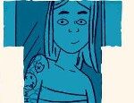
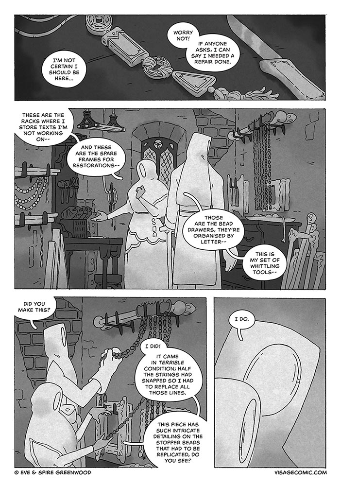
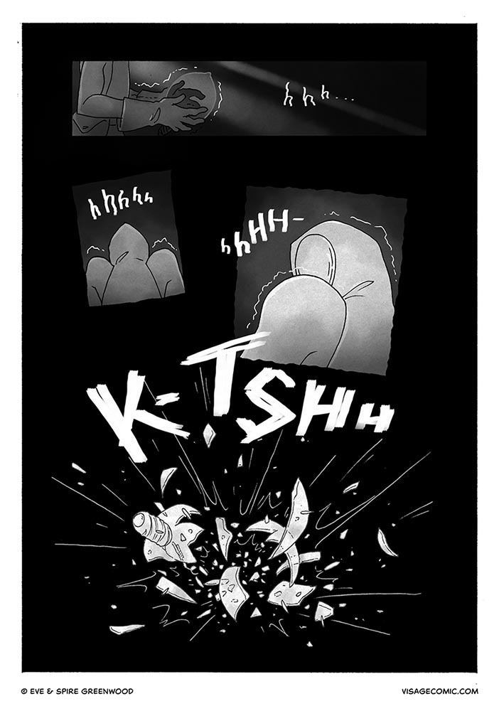
It took two years for Spire to draw the comic. For this story we decided on a stark greyscale style, with very simple shapes and restrained but confident linework. Every single page of the comic was inked traditionally on A4 paper with a 0.1 Micron. The book itself is only A5, but drawing it bigger than needed meant that Spire could add plenty of detail where necessary. Each page was then scanned in before being digitally shaded and sent over to Eve for lettering in Photoshop.
So much of this comic is intertwined with our own relationship, our time spent apart, and the few precious moments we were able to share before Spire was able to move to the UK. Spire drew on imagery from around Scotland when designing the countryside and buildings, particularly our home of Edinburgh, and Orkney is a constant presence throughout; we used a photo of some rocks we saw when we visited as a texture overlay to give the artwork some grit.
This texture also served to accentuate the recurring theme of hands and creation throughout the book. For the most part, the characters’ hands are the only exposed body parts we see, so they do a lot of character acting, but Spire also took care to spend time showing characters working at their craft. The thought here was to emphasise that everything in the world of Ruin – clothes, baskets, the House itself, were all built and maintained by devoted human hands. The Divine Visage, distinctly handless, has no part in the construction of its own sanctuary. Even though the greyscale shading was digital, using this texture hopefully brings back some of that hand-drawn feel to the page and emphasises that the comic, too, was created out of devotion.
Ruin was a labour of love for us both, and even more special to us thanks to the surrounding context of its creation. As the pages were created and the story came to life, it reflected the story of our own relationship and it’s our favourite project we’ve worked on.
We dedicate Ruin to those who cannot run.
You can read Ruin for free at visagecomic.com or buy the hardback and PDF at evegwood.com/thunderstorm/divinevisage.
Article by Eve and Spire Greenwood