


In ‘Covers Album’ we ask comics creators, publishers and commentators to pick three of their favourite comic covers …but with a small twist. One must be chosen for aesthetic reasons, one for inspirational reasons and one for pure nostalgia!
This week it’s the turn of Broken Frontier’s very own Holly Raidl whose webcomic Apricots can be read online here…
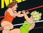
Nostalgia Choice: Death Note Vol. 1 Black Edition (2011) by Takeshi Obata (Viz)
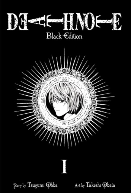
Like many people in my age group I grew up reading a whole lot of manga. My sister and I used to go to the empty section of the bookstore and stare at volumes for hours trying to discover new series. Death Note was such a big and iconic series that even the local library had it in stock. It tells the story of Light Yagami who finds the notebook of the title, which when he writes people’s names in it they die. It’s an intense, suspenseful story regarding whether it’s morally good to kill “bad” people. The cover art generally had a gothic vibe fitting for both the subject matter and the time it was released. These black cover editions always really stood out to me though – the simple white image on black really brought out the delicacy of Takeshi Obata’s line art. Death Note led me towards reading more works with darker themes.
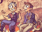
Aesthetic Choice: The Foldings (2017) by Faye Simms (Self-published)
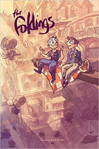
A short comic introducing readers to Faye Simms and Joann Dominik’s fantasy setting of The Foldings. It also happens to be the first comic I ever wrote a review for… I’ve always been a big fan of Faye Simms’ artwork and the cover illustration for this book is divine. Simms usually house gorgeous backgrounds alongside cute, emotive characters. Capturing the expansive city the story is set in alongside the atmosphere of a calm date- providing both context and story. The cover also references the famous “Lunch atop a Skyscraper” photo, the addition of a pop culture reference making the fantasy world depicted appear closer to reality. The use of colour on this cover is ethereal and eye-catching.
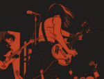
Inspirational Choice: Mami (2018) by Diigii Daguna (Peow)
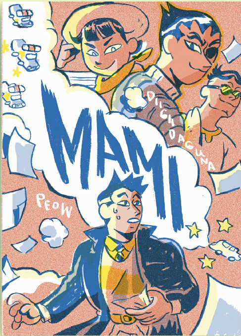
Mami tells the story of an art thief and a detective, enemies, who happen to share a fondness for good food.
Diigii Daguna is extremely good at creating film poster-style compositions and Mami‘s cover is no exception. The bright colour palette creates a sense of warmth and vibrancy, a feeling that the entire story exudes. Note the depiction of a car chase drawing the eye from left to right through the title’s text.
I picked this book for inspiration only partly because of its use of colour and composition. Having been a fan of Diigii for really long time I was naturally very excited for the release of this book – Diigii’s art always reminds me to take joy in making art. There’s something in the way they use texture and gestural lines in their work that makes me think about the fun in making artwork.
For more on Holly’s own work follow her on Twitter @iliadtea Instagram @iliadtea.
Read the full ‘Covers Album’ back catalogue here. If you’re a comics creator, organiser, commentator or publisher and you’d like to take part in Covers Album contact us by e-mail here.