It seems I’m late to the party, once again. I first encountered Patrick Atangan’s work last year, when I covered Invincible Days, his bittersweet collection of shorts exploring his relationship with his beloved grandmother.
At the time, I was struck by Atangan’s unique style and voice and his intuitive ability to balance words and pictures in such close quarters. With each story running only a handful of pages, I was suitably impressed by the efficiency of both Atangan’s narration and imagery.
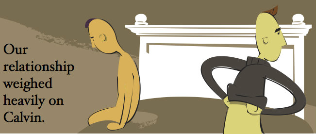
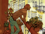
As in prose fiction, the graphic short story is a testament to the mastery of one’s craft, its length 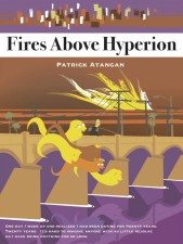 constraints perhaps even more restrictive when applied to comics’ visual platform. In Fires Above Hyperion, Atangan once again turns to the short story format to examine the highs and lows of dating in Los Angeles from the unique perspective of a gay Filipino man.
As in Invincible Days, the interconnected stories found in Fires Above Hyperion represent a bittersweet, often brutally honest reflection of Atangan’s internal monologue. He pulls no punches in his assessment of his own emotional shortcomings yet is able to view his less-than-stellar dating record with a maturity and self-deprecating sense of humor that only comes after twenty long years in the trenches.
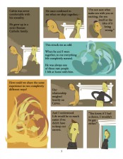
Atangan’s artwork in Fires Above Hyperion is a revelation. The intricate interplay between shape, color and linework is graphically bold but somehow understated, and appropriately caps off a career spent exploring the boundaries of story and style.
But alas, as you’ll soon read, Atangan is stepping away from the world of comics to focus on a burgeoning furniture design business that allows him the freedom to create and work with hands in a medium that doesn’t constantly question its own validity.
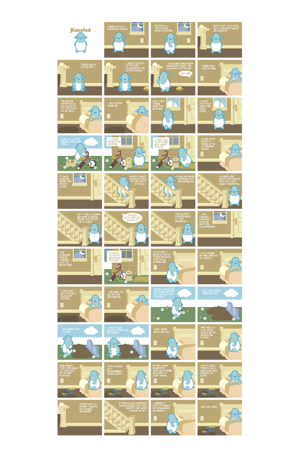
Thankfully, I had an opportunity to chat with Atangan via email regarding what could very probably be his last book. Be sure to check out the previously unpublished story from Invincible Days the artist provided BF – just in time for Halloween (and my birthday, incidentally!).
BROKEN FRONTIER: It can’t be an easy decision to pour oneself out onto the comics page in an autobiographical work – especially when you’re exploring your own dating life. What was the impetus for this retrospective and was it harder than you thought to look in the mirror?
 PATRICK ATANGAN: Coming off Invincible Days, which was a book of autobiographical shorts I did last year, doing a more adult-oriented book was a natural transition. In fact, much of the writing I did for Fires Above Hyperion was done while I was working on the other book.
The short stories in Fires were a bit of a break for me. Invincible Days was a book about death in many ways – not only the literal death that occurred in it, but the death of a childhood as well. It was incredibly difficult to write.
Fires started off as an easy book – something that was supposed to be lighthearted and fun. It slowly evolved into deeper introspection when I started getting into my longer-term relationships.
I love to make fun of myself. I’m my worst critic and the first to poke fun at the obvious multitude of my
flaws. This comes in handy when you are doing autobiographic work.
When I write, I step back to get perspective, to distance myself. There are a lot of odd justifications and warping of reality we do in our heads to get through our days. We do a lot of lying to ourselves, and much of the time we don’t even know we are doing it.
What ended up happening was I eventually saw myself as a character, an avatar of sorts. What’s ironic is that although this character isn’t how I necessarily see myself as a person in my head, it’s probably how people perceive me in real life. This book is probably closer to the truth than the biased narrative in my own head.
Many of the endings in the book seemed very ironic or at least unexpected to me. An example of this would be in the title story, where you’re left feeling a sense of connection and permanence after an awkward final encounter with an ex-boyfriend. How much of that irony was conscious on your part? Was it a product of hindsight?
Because these stories are a product of my own history, the endings I write often try to make sense of it all. A real-life event doesn’t necessarily always have a clear beginning, middle and end. Often times, life can be sloppy, and especially when it comes to relationships, you leave things angry and open-ended.
Or at least I do, because I’m an asshole. One of the reasons I wrote this book was to give myself some idea of closure. These stories are a reflection of that.
Many of the people I write about I’ve fallen away from and don’t speak with anymore. I can’t get closure by sitting them down and talking about our feelings. Who does that? I know, I know – adults do that. But one thing you will quickly realize in reading this book is that I’m hardly a fully functioning adult.
The city of Los Angeles feels very much like a character throughout the book and has many faces. How much did LA shape you as a person and as an artist? Do you think you would be the same artist if you lived elsewhere?
 One thing I’ve noticed about dating in LA is that a true Angeleno is a rarity. Most of the people I meet are transplants, people who move out here, usually for school or to work in entertainment. A lot of the people that grow up here have the common sense to pick up and leave. The ones that stayed behind are either stuck in a rut or just plain crazy – in my case, a lot of both.
Los Angeles is can really be summed up by looking at the LA River. Yes, LA has a river. It’s a dried up concrete gully that cuts through the middle of downtown. It doesn’t function as a river. It’s more of a storm drain, a receptacle for waste. It isn’t much to look at, but like much of its decaying infrastructure, it is celebrated. During the weekends you can see bikers ride along the dirt paths above it.
Los Angeles wouldn’t be as fun to live in if it had its act together. LA is like the gay, unemployed younger brother of the family. He doesn’t have a clue and everybody is worried about him, but he can be a lot of fun by 6pm when he is over his hangover.
Obviously I see a lot of LA in myself. One thing I am grateful for is its burgeoning art scene. If I lived anywhere else I probably wouldn’t be able to do my art.
Over the past couple of years I’ve been transitioning from comics into building custom furniture. There are quite a few businesses, hacker spaces and community workshops in the city that have been popping up where an artist can build something that would have been economically unfeasible otherwise. I see them as sort of an incubator for my small business. Cue shameless plug… http://patrickatangan.com/
Your style of art in Fires Above Hyperion is vastly different from your previous book, Invincible Days, yet somehow it still felt distinctly yours. What comes first when you sit down to create a graphic novel – the story you want to tell or the style of art you want to explore?
All of my books have distinctively different artwork because I believe it is my job as an illustrator to manipulate the art to best tell the story. I’ve always felt it was a failing of the comic-book industry that it openly promoted its artists to have their own signature style.
 Yes, it can be fun and flashy and it helps to sell books, but how does that help to tell a better story? Having a style can be nice. But style can also be a hindrance – something that prevents you from growing as an artist or a writer.
With Invincible Days, I took the stuffed animals, my sister’s sticker collection, objects of my childhood as visual cues for the art. By turning the characters themselves into cute little stuffed animals, it made the stories more powerful.
Fires on the other hand was completely different. I needed a more mature look, something that on the surface can be seen as loose and fun but can also be seen as anxious. Fortunately for me I already had something.
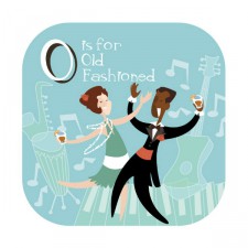
The art style for Fires Above Hyperion was cannibalized from a different project I worked on in 2008, an ABC Cocktail Book for Rizzoli. It was a cheeky little 4″ x 4″ book of classic cocktail recipes. A sweet little illustration on one side with the name of the cocktail, eg A is for Apple Martini, and a brief history of the drink followed by a recipe on the other.
The pages were supposed to be printed on thick stock blotter paper so you could pull it apart and use the pages as coasters. The art was meant to reference the jazzy 1950s illustrations of the likes of Mary Blair and Charley Harper. But unfortunately that project was shelved and forgotten about when the economy tanked. One of these days I’ll put it up on Etsy as a double-sided poster or something.
As I said previously, there’s a certain quality in your artwork that readily identifies it as yours. The way you use shapes and color to suggest objects and reinforce emotional beats translates across all of your works. How much does your design work outside of comics inform your graphic storytelling?
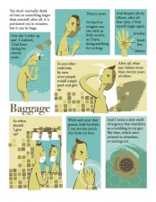
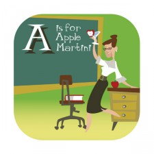 Color plays a big role in most of my books; more so in Fires Above Hyperion. Color is almost as much a storytelling device as the linework of the art itself. I have this funny habit. Whenever I visit a Home Depot, whether I have to paint a room in the house or not, I swipe color swatches from the paint section. I love the perfect flatness of those 2″ x 2″ squares. They are about as close to a color menu in Adobe Illustrator as real life can get.
As I write, I’m constantly shuffling these guys around, trying to arrange a scheme that would not only look good in a living room but also best tell the story. Love scenes can start off in hues of teal but melt into warm oranges and yellows, suggesting passion. And in the case of this particular book – and, let’s face it, the majority of scenes in my love life – they would often end in a disappointing taupe.
I plan for this to be my last book, but were I to do another one, I can easily imagine the artwork becoming so abstract it is reduced to nothing but fields of color, texture and pattern to guide you through the story. That would have been fun. Too bad.
You use imagery extremely well throughout the book. Birds appear throughout many of the stories; I thought at first they represented a kind of freedom but wondered later if it wasn’t a little more complicated than that. What do the birds mean to you, or am I reading way too much into things?
There is a lot of symbolism in this book – both intentional and not. The very first story I wrote for it was ‘Gary’. When I showed it to P. Craig Russell, he commented on the sexual symbolism. The phallic nature of the lighthouse, the drawstrings on Gary’s board shorts that resembled testicles. This wasn’t conscious on my part. It was just my sexually frustrated id acting out. But the birds were intentional.
Birds are social creatures. Have you ever looked up and seen a migratory formation? I often imagine them silently arranging themselves like a ballet, each knowing their place and falling into a perfect line without a cue. Or it would be perfect if it were not for that ugly one in the back who looks like he’s always trying to catch up.
It’s almost as if the flock is purposefully trying to lose him. I’m that ugly bird that doesn’t know what he seems to be doing. The one that missed the morning meeting and spends the entire day pretending, trying hard not to look lost.
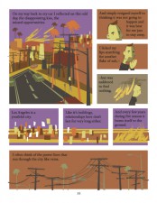 I couldn’t help but notice the very distinct “shadow” splitting the faces of the people depicted in the book. It gave me an impression of duality – not necessarily in a negative way but matter-of-factly or realistically. Was this a simple stylistic choice or a way of expressing the contrast between our public actions and private thoughts?
The art in the ABC Cocktail Book had the same cubist side split faces. However, they were a lot more subtle in the cocktail book. It was something I played up in Fires because I wanted the art to be a bit more abstract, something that was reduced to a basic.
I rendered buildings and cityscapes to simple rough rectangles, something that looked more like scattered post-it notes on a cork board. I wanted the art to not look like a representation of life but an interpretation, much like I approached the storytelling.
The cubist nature of the faces was meant to be a bit jarring, something that made you pause and stare a little longer. The emphasized faces helped to express the emotion. The book was 90% driven by an internal monologue.
Although you can read this book and understand most of the story without looking at the illustrations, you still wouldn’t understand the intent. Half of the story is still in the uneasiness of the art. The world I rendered is messy, anxious, meant to make you fill a bit ill at ease.
It’s how I feel whenever I drive out onto the freeway, whenever I go out on a first date or to a party. Whenever I get nervous, I get this odd quick and hollow feeling in my wrists as blood rushes through them. That feeling is the way this book looks.
At the end of our last interview there was a sense that your career in comics was somewhat in question. Does that feeling or direction still hold? If not, what’s next up for you?
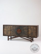 The past couple of years I’ve been busy getting a custom furniture business off the ground. There’s something satisfying about making something with your hands. When I build a chair nobody questions its validity. It’s a chair. It’s pretty. You sit on it.
Although sometimes there are deeper meanings and stories behind my designs, nobody expects anything of its existence other than it’s something for you to put your ass on. It feels like a more honest way of life.
I’ve never been comfortable as a writer and always saw my career in comics as a series of bad investments accruing diminishing returns. The industry has always been lukewarm to my work and I’ve never felt welcome. Apart from my last two, I’ve never been happy with my books as end products. And I’ve always felt like a fraud whenever I told people I make comics.
I’m tired of living in front of a computer. I want to build stuff.
Comics’ loss will certainly be furniture’s gain. But never say ‘never’, eh? Anyway, as promised, here’s a previously unpublished short from Invincible Days, just in time for Halloween! Thanks Patrick!


