


") In ‘Covers Album’ each Wednesday we ask comics creators, publishers and commentators to pick three of their favourite comic covers …but with a small twist. One must be chosen for aesthetic reasons, one for inspirational reasons and one for pure nostalgia!
In ‘Covers Album’ each Wednesday we ask comics creators, publishers and commentators to pick three of their favourite comic covers …but with a small twist. One must be chosen for aesthetic reasons, one for inspirational reasons and one for pure nostalgia!
This week it’s the turn of that splendid supporter of small pressers Simon Russell who made my life so much easier by providing his own bio:
“Simon Russell at boinggraphics.co.uk is the author of Nearlymades and That’s Not My Merkin, he’s managing editor at acesweekly.co.uk, the pet designer of the Cartoon Museum in London and mac monkey for drawthelinecomics.com. He’s trying to develop his ComicPopUp model for selling small press comics to the uncomicked and is co-editor on the upcoming Graphic Justice newsletter. That’s enough.”
Aesthetic Choice: Bacchus 1 (1988) by Eddie Campbell (Harrier Comics)
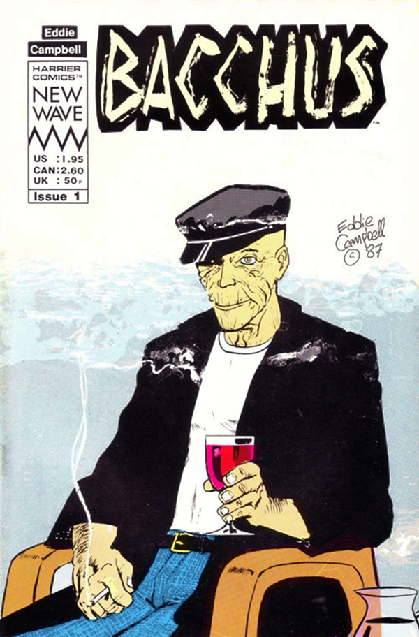
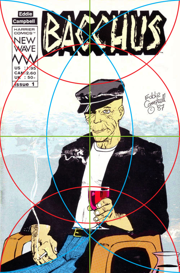
I’d been devouring any comic from Eddie Campbell since I stumbled on his self-published mini-comics a few years previously and was super excited when Harrier started Deadface in 1987. Relaunched as Bacchus after eight issues, the series remains a delight 30 years on – its narrative playfulness, mythological allusions and just plain GOR-JUSS drawing are still head and shoulders above any comic mining the same territory of stories-about-stories.
Without giving any of the story away, this particular cover tells the reader everything they need to know about what’s inside, the body language and pose of the figure hinting at his age and status as an unreliable narrator reinforced by his slightly bemused demeanour while dressed like Corto Maltese in a retirement home. The colour choices manage to be simultaneously bold and subtle, with stark contrast, delicate shades and a bold crimson highlight to draw the eye.
And what a composition! All the vital elements sit on arcs and quadrants from the edges of the page… Even Campbell’s signature is placed (at a time when cover credits were as rare as hens’ teeth) to let the browser see who made this comic without intruding.
The penmanship is deceitfully accomplished with no wasted lines – the shadows and reflections in the glass and the jug; the drifting cigarette smoke, the change of direction over Bacchus’ crotch. This is a drawing that took years to be able to make.
This cover works in a rack, on a shelf among other comics or on its own on a table, let down only by the clunky Harrier Comics information box.
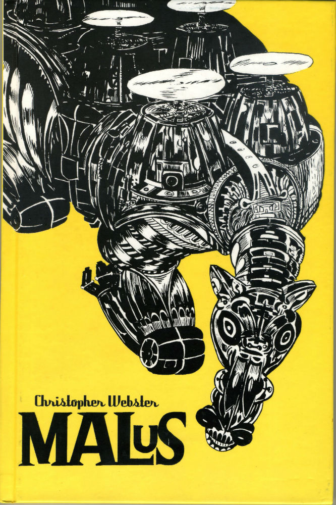
Inspirational Choice: Malus (2005) by Chris Webster (Mmmnnnrrrg Editions)
So many covers have inspired me over the years – it would be easy to pick something by Tom Sutton, Gil Kane or Jack Kirby – plus most of the previous choices in this series. But this one gets the nod because it’s rare to find a cover I’ve actually wanted to copy as an adult.
Malus is the obscure collection of an even more obscure series of A4 comics that Chris Webster self-published in 1995 (an artist I really hope will be returning to comics soon if rumours are true). Bold black and white shapes sit flatly on a yellow ground that is somewhere between Buttercup and Mustard. The combination of hopeful and tangy managing to feel nightmarishly ‘off’. Webster’s art has a grotesque beauty that comes to the fore in this giant equine helicarrier – sort of oily and animated.
I love the movement around the page and the way that the artist has managed to curl his image around the title in a collection of masses and details that look great viewed from any angle. Fans of dense intense comics by the likes of Henry Flint or Junji Ito should keep their eyes peeled for copies of Malus or Webster’s other self-published works, Gardenhouse; Neversedge and Wormwood (there must be more, but that’s all I have and the web is letting me down in looking for more)
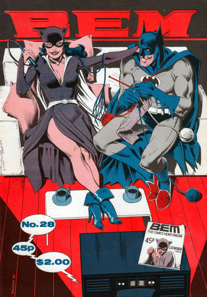
Nostalgic Choice: BEM 28 (1980) by Brian Bolland (Martin Lock)
Comic nostalgia, for me, falls into two camps: cool things I remember from when I was at the right age that now look ridiculous even though I still love them, and things that were just fun in the way only comics can be.
DC in particular had lots or weird and wonderful covers with heroes in crazy situations (Superman with a lion’s head, Flash being turned in to a puppet and so on) which still tickle my fancy.
Basil Wolverton, Wally Wood and Ken Reid still look great on any cover.
But it’s old fanzines that hit ALL of my pleasure buttons… the US had The Comics Journal, Collector’s Dream and RBCC for me to drool over, but the UK zines were always more fun. Silly pun covers vied for a turn with unique, beautiful renderings by emerging professionals and enthusiastic fans. It’s really hard to pick a favourite from my shelf and I could go for any of the following:
ARK covers by Brendan McCarthy (24 and 33); Kevin O’Neill (25); Shane O’Dwyer (32).
BEM by Hunt Emerson (22); Brian Bolland (22); Mick McMahon (29); Kevin O’Neill (35).
Fantasy Advertiser which brought us John Ridgway (94); Brendan McCarthy (99); Dave McKean (109).
Graphic Sense covers by Alan Hunter (2) Luke Raindord (3) and Kieth Luck (4) were colourful delights.
Masters Of Infinity had a Mick McMahon treat on issue 7
The list goes on… Comic Media News, Infinity, Ogre, The Owls Effort etc., etc.
Nigel Kitching on FA 93 or Martin Hand on FA 95 so nearly got picked for this because I get a frisson of delight every time I look at them… but here’s BEM 28’s scene of domestic bliss by Brian Bolland.
BEM was the first fanzine I discovered in Dark they Were And Golden Eyed, so the nostalgia burns brightly in this zine, but even coming at it fresh today, who wouldn’t love to read this story rather than bondage Batman shagging leather Catwoman on a rooftop (with gritted teeth)?
The drawing is peak Bolland (which was a long period that probably ran from his second year as a pro until he went digital) showing his mastery of his craft and his (or Martin Lock’s) solution to a 3-colour palette is perfect, working with the horizontal/vertical lines of the sofa, the floor and the logo to ground the cartoony figures in a composition that would stand out in any shop… ironic, when most of us bought fanzines by post in those days, but you can imagine the impact of opening a brown A4 envelope one rainy morning and finding this inside. I want to go back to the superheroes of yore every time I see this!
You can follow Simon Russell on Twitter here.