Our Inside Look feature at Broken Frontier provides creators with the opportunity to share exclusive commentaries on their comics projects with our readers, giving insights into the genesis, process and themes of their work.
Today writer Tom Woodman talks about the graphic novel Future, co-created with artist Rupert Smissen and letterer Aditya Bidikar, and edited by Lizzie Kaye. The project is currently crowdfunding via the Unbound Books publishing platform.
Over to Tom!
So, Future is a 5-chapter graphic novel crowdfunding with Unbound. It’s the story of Murray, a dying astronaut, and her wife, Kay, who are shot forward through time to find a cure, rewrite the future, and prevent humanity’s imminent self-destruction. It’s 118 pages and you can read the first 22 for free at tinyurl.com/FutureCh1, which the below pages are taken from. Then you can back the book at unbound.com/books/Future!
This article was mostly written by Tom as Rupert is busy with the last fifteen pages – you know how it is.
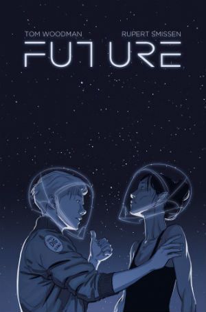
Cover + Cover Alt
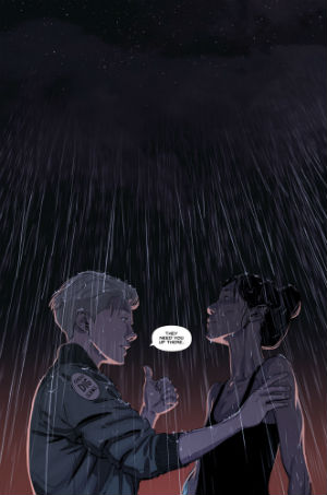
We had a couple of options for covers, but the story is character-driven rather than action-oriented, so we wanted to have that centre-stage from the start and stay honest about our focus, rather than plastering flaming rockets or funky sci-fi effects across the cover. This is Kay and Murray, and the story’s about them. The cover actually started off as a splash page in the middle of Chapter 1 (which you can see on the right above), before we realised it should be the cover. It perfectly encapsulated the series’ focus and vibe – these two women, looking into the unknown, together.
So Rupert recoloured the splash page we had, removed the ‘they need you up there’ speech bubble (which he’s perfectly communicated through body language anyway), added the elegant little lines of the wireframe helmets, and here it is. The title font (designed by Rupert, like almost everything in this darn book) was kept very minimalist. We tried some flashier designs, but again a simple, stripped-back font best fitted thematically.
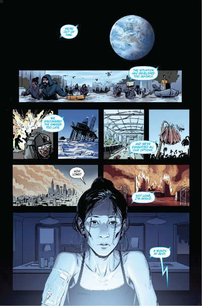
Page 1
The first page of a graphic novel is horribly important, especially when it’s the first of your career. Prove yourself and set out the book’s concept ASAP, please and thank you. Luckily, I had this page in my head before we started, which is a good chunk of our concept; Murray and near-future Earth’s terminal diagnoses intertwined. It also gave us an opportunity to set out the state of our world without losing the character focus. If a page can be multi-purpose, all the better.
My script for Murray’s first appearance here focused on her looking awful, which Rupert again achieved neatly. I’ve seen books where, no matter what, everyone’s gorgeous all the time – I’ve even seen a script with ‘sick but sexy’ in it. We wanted Murray to look old, tired, and dying. To emphasise this, Rupert used the light of the hologram to wash her out and add further shadows under her eyes, which was so simple but genius.
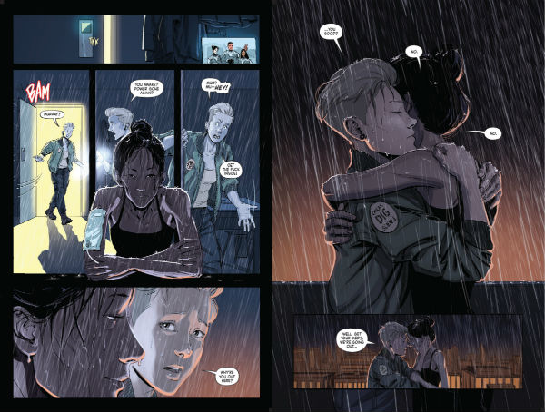
Page 6/7
Look at that rain. One of the beautiful things of working closely with Rupert (this was our second project together after being joint best men at a friend’s wedding) was being amazed at how effortlessly he makes magic. We both got to impress and surprise each other as we went along with techniques the other hadn’t considered, which is a lovely way to work together, and part of what sets writing for comics apart from your average story.
The right-side page is actually the first time Kay and Murray are together in the book, and several reviewers picked it as the stand-out panel in this first 22-page chapter. It initially had a bit more dialogue and more panels, but the simplicity of the image asserted itself, especially once I’d seen Rupert’s draft. It’s hard to just shut up as a writer, but how many pages of long power-speeches do people forget about in superhero comics, when something like ‘Ultron, we would have words with thee’ is iconic? Also, there was a moment where P.7 was a left-hand page, but whereas having it as a ‘reveal’ was an option, I wanted to have that feeling of impatience on P.6, so the reader subconsciously wants to rush to Kay and Murray’s reunion on P.7.
Page 14/15
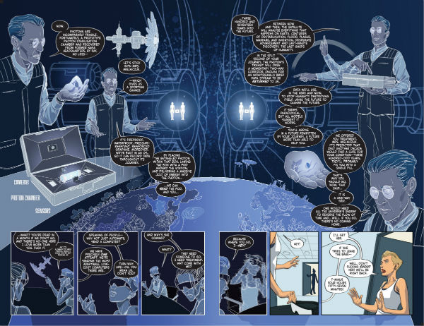
Oh boy, we spent SO long on this spread. I think, script alone, I took two weeks redrafting over and over, to trim everything I could and make it as clear as could be, while fitting in a tonne of information. As one of my day jobs is literary editing, it was sweat-inducing fun, though a real test. The spread came from the fact I didn’t want to be laying out huge infodumps throughout the whole book, so we took what was a 6-page explanation of the science, the tech, the mission, the dangers, the pros and cons, and Rupert and I focused it into a double-page spread, which Aditya’s lettering somehow kept uncrowded.
When our editor, Lizzie, heard Future was going to be a time travel book, she asked whether I’d thought through the science of it. As soon as I showed her my research reading pile (including Steven Hawking’s A Briefer History of Time, which may’ve been overkill) and started talking about quantum entanglement, we were set. Well, Lizzie asked me to shut up anyway, which I think is a good sign.
Page 19
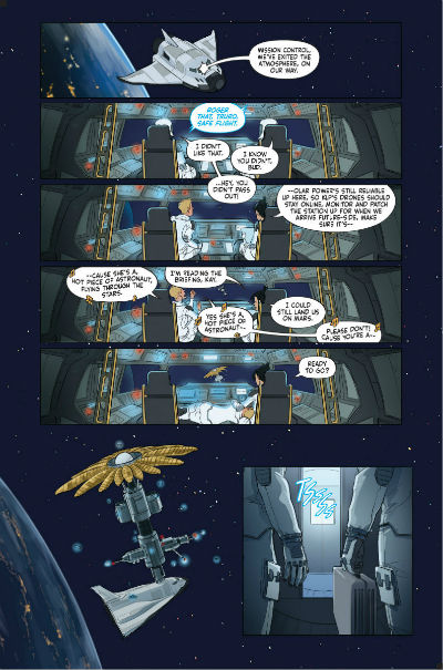
I’ve picked all the least chatty pages for this feature, but oh well. We had a lot to fit into this first chapter, as we wanted the time travel journey to begin before chapter’s end, so we created some very economical pages; see the car crossing the country and a whole night in three panels from P.9. Here, Kay and Murray get from orbit to KLP-004 space station in a single page. And both pages actually feature my favourite technique, which I demand of Rupert so damn often – repeated POV as time passes. Here Kay and Murray have just hit orbit; it’s the calm after the storm of take-off, and I wanted some character fun, while sneaking in a bit of info as well (Murray explaining how the station’s going to survive in orbit for centuries).
Also, ‘Hot Piece Of Astronaut’ is a great bit of wordplay and I’m staking my career on it.
Chapter 2 Preview
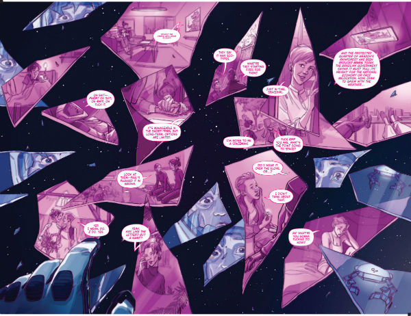
And finally, a little spread from Chapter 2 of Future, exclusively for Broken Frontier. At the start of the book we’re joining Kay and Murray at what might be their end, but as the book goes on we’ll look back at their lives together and how they ended up here. We’ve scattered some of those moments here as Murray’s life flashes before her eyes; a few we’ll revisit and a few are just snapshots. It’s almost essential to enjoy a non-linear approach during a time travel story, especially as it means we can shake up the tone as we go, rather than being solidly caught in the extremely intense few days Future covers. Also, it sets up some beautiful juxtapositions and lets us highlight why the life Kay and Murray have is worth saving, just in time to make you scared they’ll lose it.
From a technical standpoint, Rupert went for a very simple blue/purple colour scheme to break up present and past images, and made sure to keep all the images out of the middle of the double-page spread; nothing worse than losing info into the comic crevice! And, as you can probably see, the order of the panels/shards is deliberately confused. We wanted to break up the layouts so far with this, and to throw the reader into slight disarray – for redacted reasons.
Back the book, you’ll see; we’re at www.unbound.com/books/Future
Follow Future the Comic on Twitter here


