 In ‘Covers Album’ each Wednesday we ask comics creators, publishers and commentators to pick three of their favourite comic covers …but with a small twist. One must be chosen for aesthetic reasons, one for inspirational reasons and one for pure nostalgia!
This week it’s the turn of rising small presser Nick Prolix who has kindly provided his own bio for us!
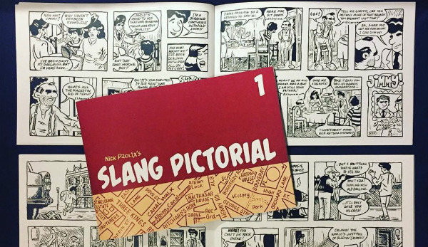
“Nick Prolix has self-published two issues of his one-person anthology comic, Nick Prolix’s Slang Pictorial, in which he tells stories set in a fictional London neighbourhood at the start of the 1960s. He is also drawing a similarly retro Kung Fu crime caper written by Tony Esmond to be published in 2018. You can follow his work and buy his comics at www.thesheepandthewolves.com“.
If you’re a comics creator or publisher and you’d like to take part in ‘Covers Album’ then e-mail BF Editor-in-Chief Andy Oliver – contact details here.
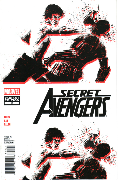
Aesthetic Choice: Secret Avengers #18 (2010) by David Aja (Marvel Comics)
I mean honestly, I could pretty much pick any cover by the Spanish artist David Aja for this section, from his Hawkeye covers that managed to abstract Pop Art visuals through his strong graphic design sensibility, to the even more elaborate graphic compositions of his work on Scarlet Witch. This cover to Secret Avengers #18 feels like a stepping stone to a different style of work all together, and with its stark black on white, the use of halftone effects and the off-registered neon red it points to the kind of cover work Aja developed, again alongside Warren Ellis, for Karnak.
In Secret Avengers, however, the cover manages to encapsulate all the key elements of the story through the way Aja melds three distinct visual languages. There’s two-tier repetition of the image of Shang Chi smashing the guard’s helmet that recalls the schlocky aesthetics of Seventies martial arts cinema – not just in the obvious physical analogy between Shang Chi and Bruce Lee but in the spooling reel of film cinema audiences might have seen when the projector broke down.
The halftone dots recall Shang Chi’s origins in Marvel’s Bronze Age but the misaligned red also suggests the artefacting of a glitched digital screen, pointing to the narrative that has our Seventies hero in a mind-bending space station that defies the laws of physics. As far as I’m concerned, Aja is a genius and I’ll kung fu chop anyone that says different!
Inspirational Choice: Stray Bullets #1 (1995) by David Lapham (El Capitan)
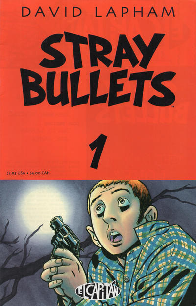
I think I liked the idea of Image Comics – creator-owned stories written and drawn by big name cartoonists – more than I did much of the stuff they were actually putting out in the early ‘90s. I didn’t connect with Savage Dragon, Spawn or Youngblood, but when Stray Bullets appeared, I was sold. I think that Stray Bullets stands as one of the most accomplished examples of long-form storytelling not just in comics, I think you can see the influence its era-spanning neo-noir in something like Noah Hawley’s Fargo TV show.
When it came to designing the cover for my own serialised crime comic, Stray Bullets was the obvious choice for inspiration. In fact, Stray Bullets #1 was the first comic I remember buying solely on the strength of the cover alone, and the first thing that grabbed me was the top heavy design with that slab of blood red colour and the bold title typography that these days reminds me of Alex Toth’s lettering. Then there is the cover image with its’ canted angle, the diagonal of the tree bisecting the panel and the whites of the boys scared eyes as big and wide as the moon. Pure drama!
Nostalgic Choice: Iron Man #150 (1981) by John Romita Jr. and Bob Layton (Marvel Comics)
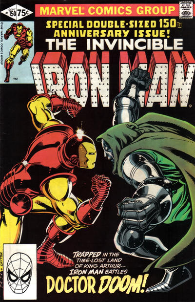
When I was in infant school, our teacher had a box of comics that we could read as a reward if we finished our class work, and so my first taste of superhero comics was a smattering of Bronze Age Marvel titles, including Power Man and Iron Fist, Master of Kung Fu and an issue of Marvel Team-Up where Spider-Man and Havok join forces to take down The Living Pharaoh! The comic that has stayed with me the longest though was Iron Man #150, a double-sized issue in which Tony Stark and a time-travelling Victor Von Doom find themselves in Camelot and must join forces if they are to return to the present.
It is still my favourite Iron Man comic and probably, if I’m being honest, my favourite comic ever, homaging equal parts A Connecticut Yankee at the Court of King Arthur and Battlestar Galactica. Much of the longevity of its appeal was down to the cover by John Romita Jr.; Iron Man and Doctor Doom squaring up to each other in profile, all coiled musculature and glinting chrome against that black background and the caption text that butts perfectly between the two armoured rivals about to go at it toe to toe. I loved it then and still love it now.
You can also follow Nick Prolix on Twitter here. Read the full ‘Covers Album’ back catalogue here.


